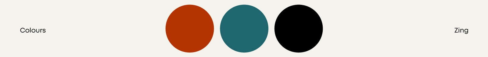
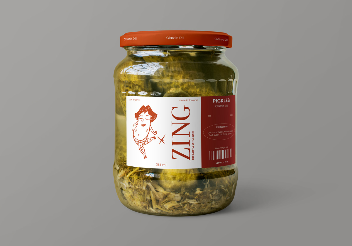
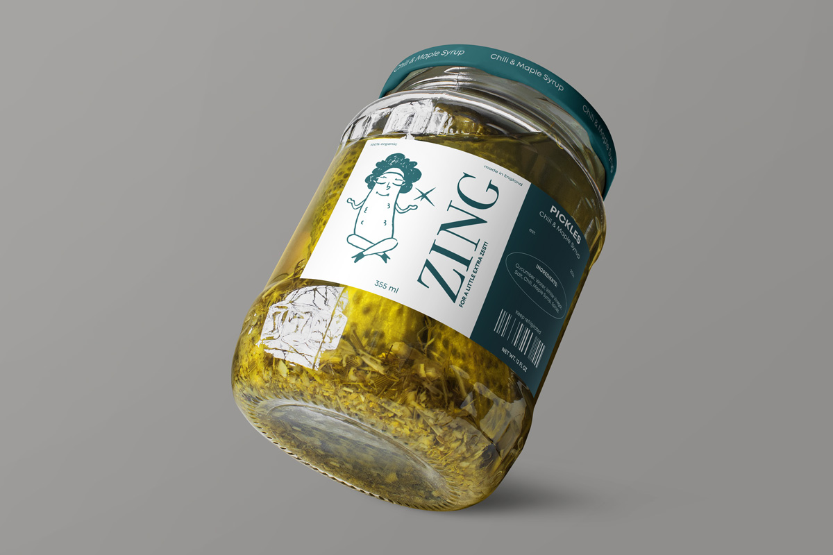
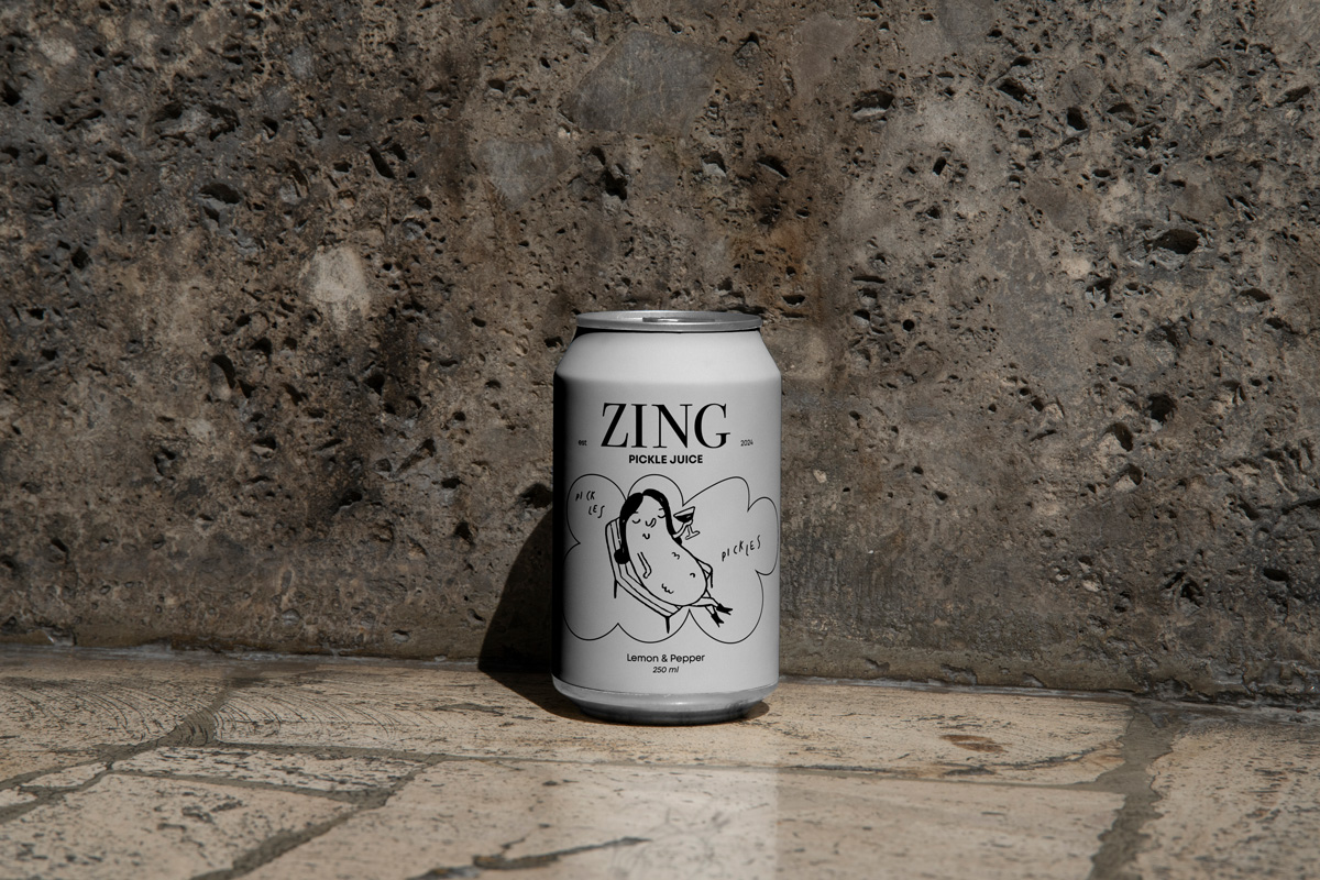
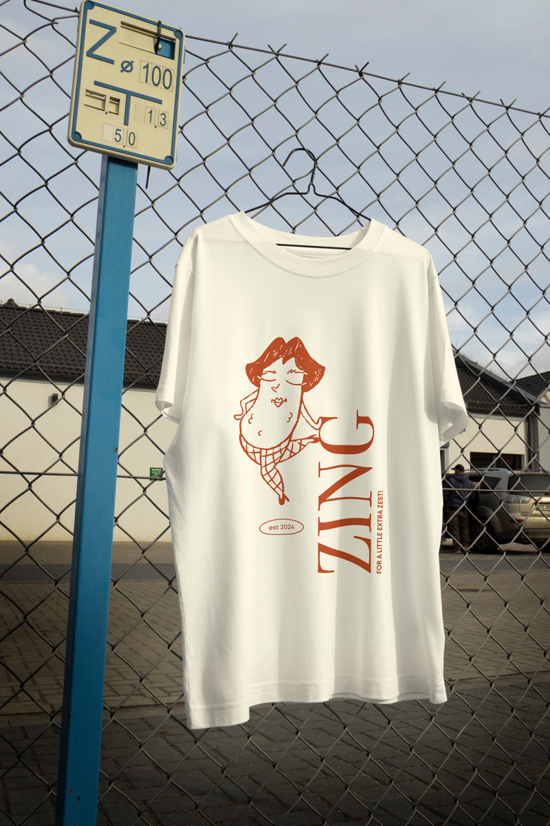
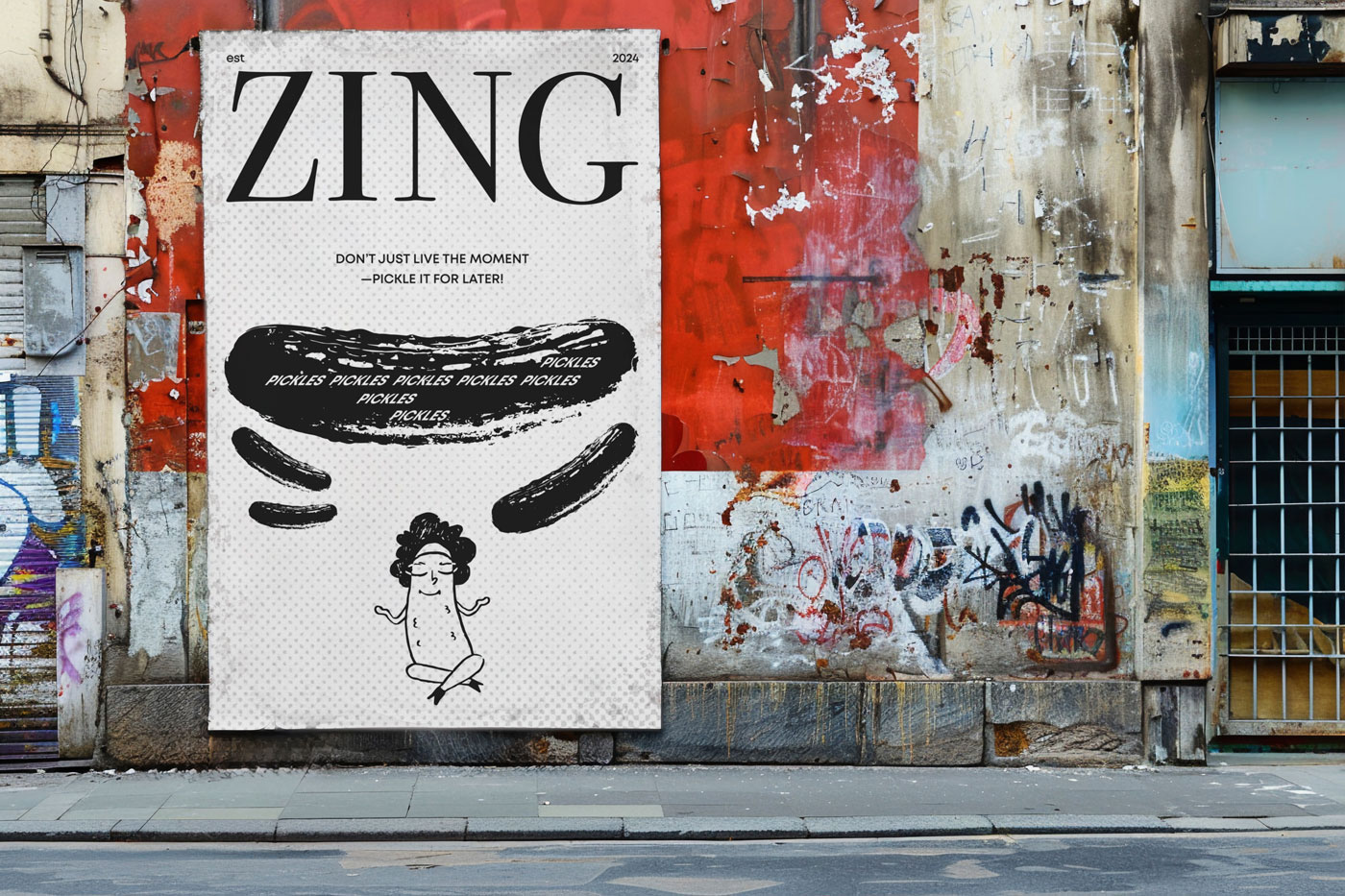
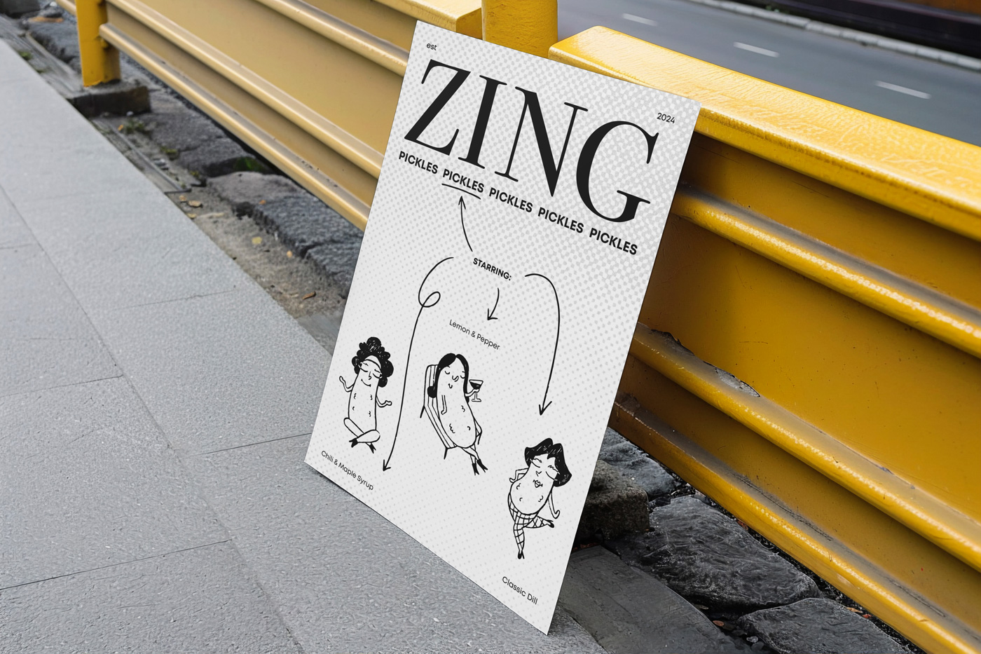
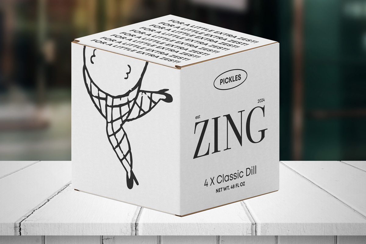
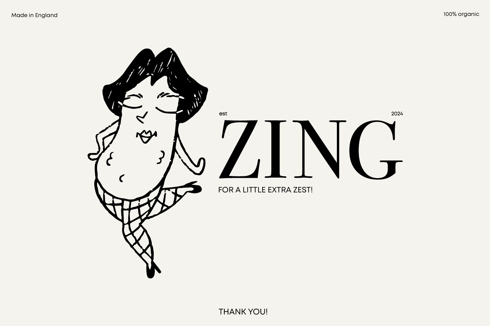
Logo that reads Lera Serheichyk in a playful, slightly irregular font. Logo that reads Lera Serheichyk in a playful, slightly irregular font.

Zing case study

Brand Design | Graphic Design | Illustartions

Zing brand logo.

Purpose

Zing didn’t have a strong visual identity and wanted me to design it from scratch. Their main idea was to show that pickles aren’t just something your grandma makes for the winter but can also be fun and playful. That’s why we decided to “give a face to a pickle” and create a set of unique characters to make their visual identity more memorable and engaging.

Design

Brand colours: brick-red, green-blue, and black, all in muted tones.
Branded zing pickle jar witha red details and playful illustration of a humanizated pickle.
Branded Zing pickle jar with green details and a playful illustration of a calm, meditating pickle.
A white canned drink featuring a playful sunbathing pickle. A white t-shirt with red details and a pickle in tights.
A poster with a humanised pickle and levitating small pickles.
A poster with three different playful pickles.
A branded box featuring the logo and a playful illustration of pickle legs in tights.
Reads: Thank you, featuring a playful pickle in tights with a bob.